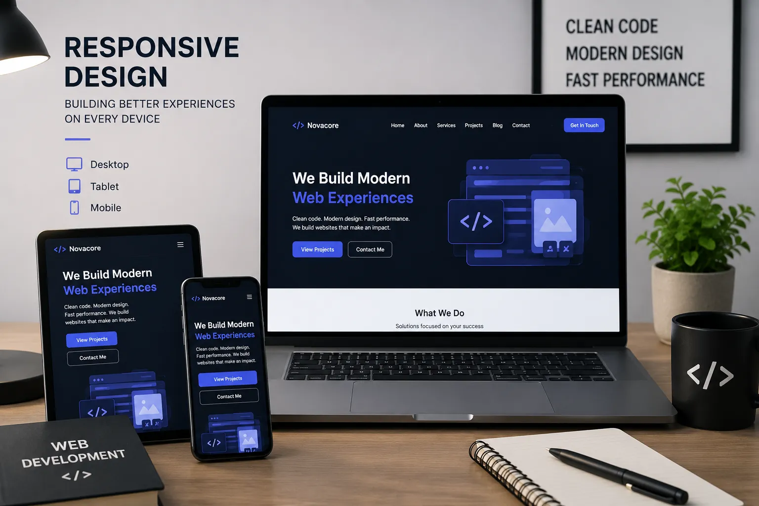
Responsive design is no longer optional. It is a key part of building professional websites that work smoothly on desktops, tablets, and mobile phones.
Introduction
In the modern digital world, users visit websites from many different devices. Some users browse from large desktop screens, while others use tablets or mobile phones. Because of this, responsive design has become one of the most important standards in professional web development.
A responsive website automatically adapts to the screen size of the user. It keeps the layout organized, the text readable, the images clear, and the buttons easy to use. This makes the website more comfortable and professional for every visitor.
1. What Is Responsive Design?
Responsive design means creating a website that changes its layout based on the device screen size. Instead of building separate websites for desktop and mobile, one flexible design is created to work on all devices.
This is done by using flexible grids, relative units, optimized images, and CSS media queries. These techniques help the website adjust its sections, columns, typography, spacing, and navigation depending on the screen width.
2. Better User Experience
User experience is one of the main reasons responsive design is important. If a website is difficult to read or use on mobile, visitors may leave quickly. A responsive website makes browsing easier because content appears clearly and buttons are simple to click.
Good user experience helps visitors stay longer, explore more sections, and understand the services or content better. This is especially important for portfolio websites, business websites, and service-based websites.
3. Professional First Impression
The design of a website creates the first impression. When a website looks broken on mobile or has elements that overlap, it gives an unprofessional impression. On the other hand, a responsive and well-organized layout reflects quality, attention to detail, and professionalism.
A clean mobile experience shows that the developer cares about all users, not only desktop visitors.
4. Improved Performance and Accessibility
Responsive design also helps improve performance and accessibility. When images are optimized and layouts are built correctly, pages load faster and content becomes easier to access. A responsive website should not only shrink elements; it should reorganize them in a smart and usable way.
For example, a three-column layout on desktop may become two columns on tablets and one column on mobile. This keeps the design clean and prevents the user from zooming or scrolling horizontally.
5. Mobile Users Are Increasing
Many users now access websites mainly from mobile phones. This means that ignoring mobile design can cause a website to lose a large number of visitors. A website must be tested carefully on different screen sizes to make sure every section works correctly.
Navigation menus, forms, images, cards, tables, and buttons should all be easy to use on mobile devices.
6. Responsive Design and SEO
Responsive design can also support search engine optimization. Search engines prefer websites that provide a good mobile experience. If a website is mobile-friendly, fast, and easy to use, it has a better chance of performing well in search results.
This makes responsive design important not only for appearance but also for visibility and growth.
7. How I Approach Responsive Design
When building a website, I plan the layout for different screen sizes from the beginning. I test sections on desktop, tablet, and mobile views. I make sure that spacing, typography, images, and buttons remain balanced and usable.
I also avoid unnecessary complexity and focus on clean structure. A good responsive website should feel natural on every device, not like a desktop website forced into a smaller screen.
Conclusion
Responsive design is an essential part of modern web development. It improves user experience, strengthens the professional appearance of the website, supports performance, and helps visitors access content easily from any device.
For every website I build, responsiveness is not an extra feature. It is a core requirement for creating a modern, reliable, and professional digital presence.